
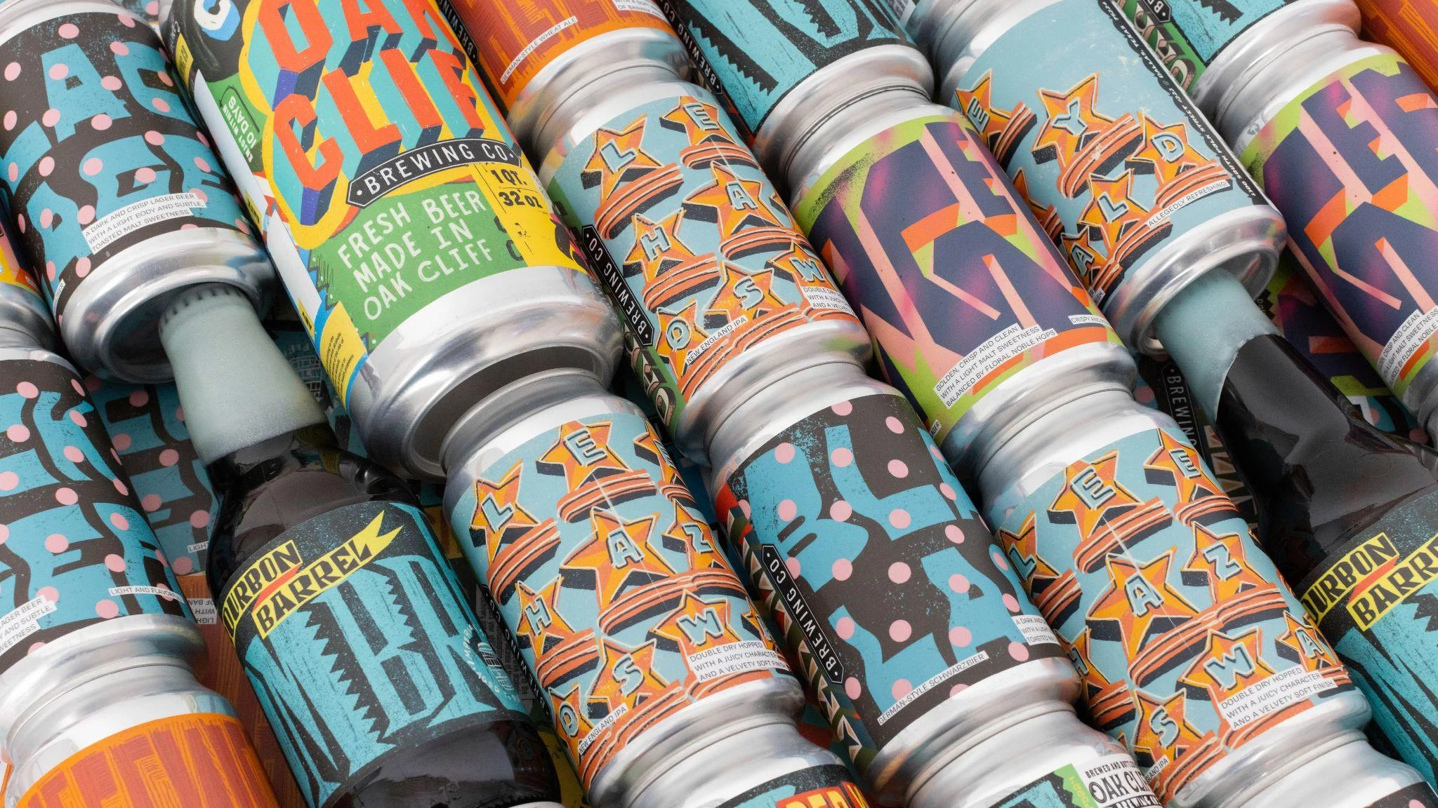
Oak Cliff Brewing Co.
A neighborhood in every can.
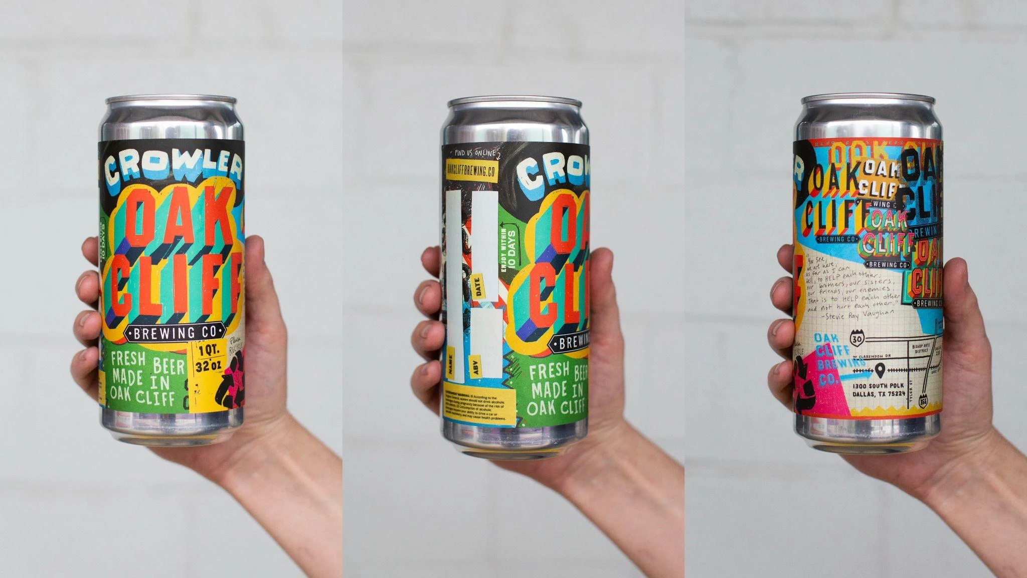
Oak Cliff Brewing’s identity celebrates the arts, diversity and everyday character of its Dallas neighborhood. The design extends across core beer labels, merchandise, tap handles and the taproom itself.
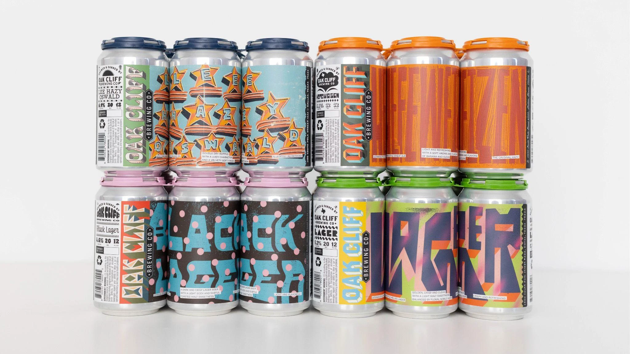
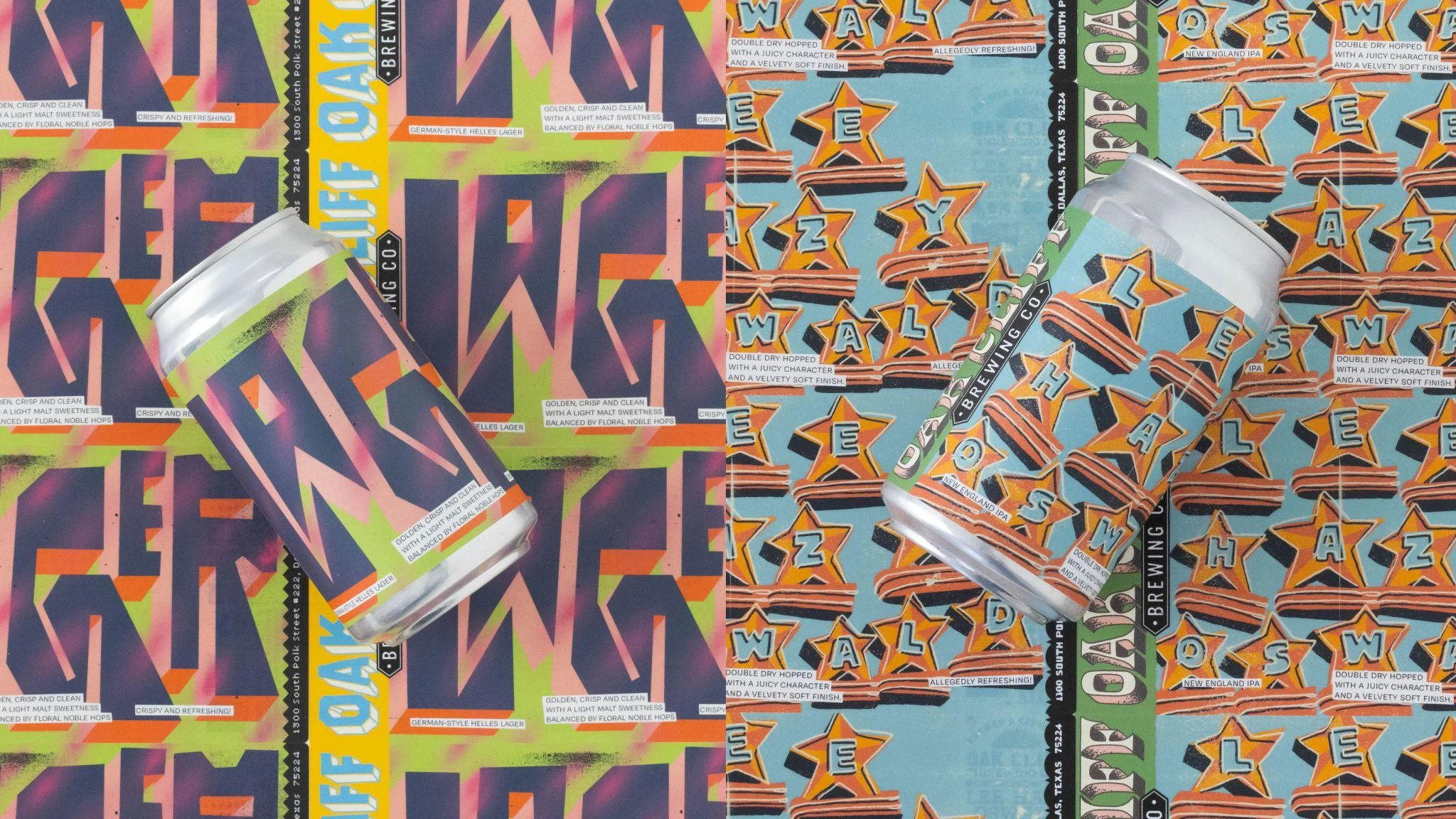
Big letters. Distinct personalities.
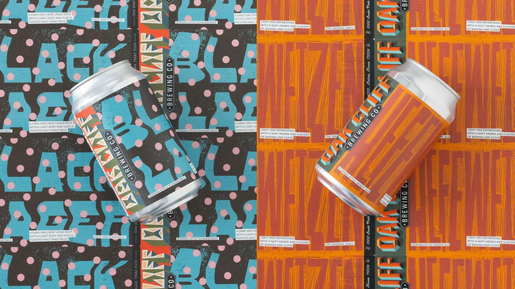
Custom, handmade typography gives each beer its own voice. Large letterforms wrap around the labels, turning a row of cans into a continuous graphic. Color and pattern distinguish the styles while keeping the family together.
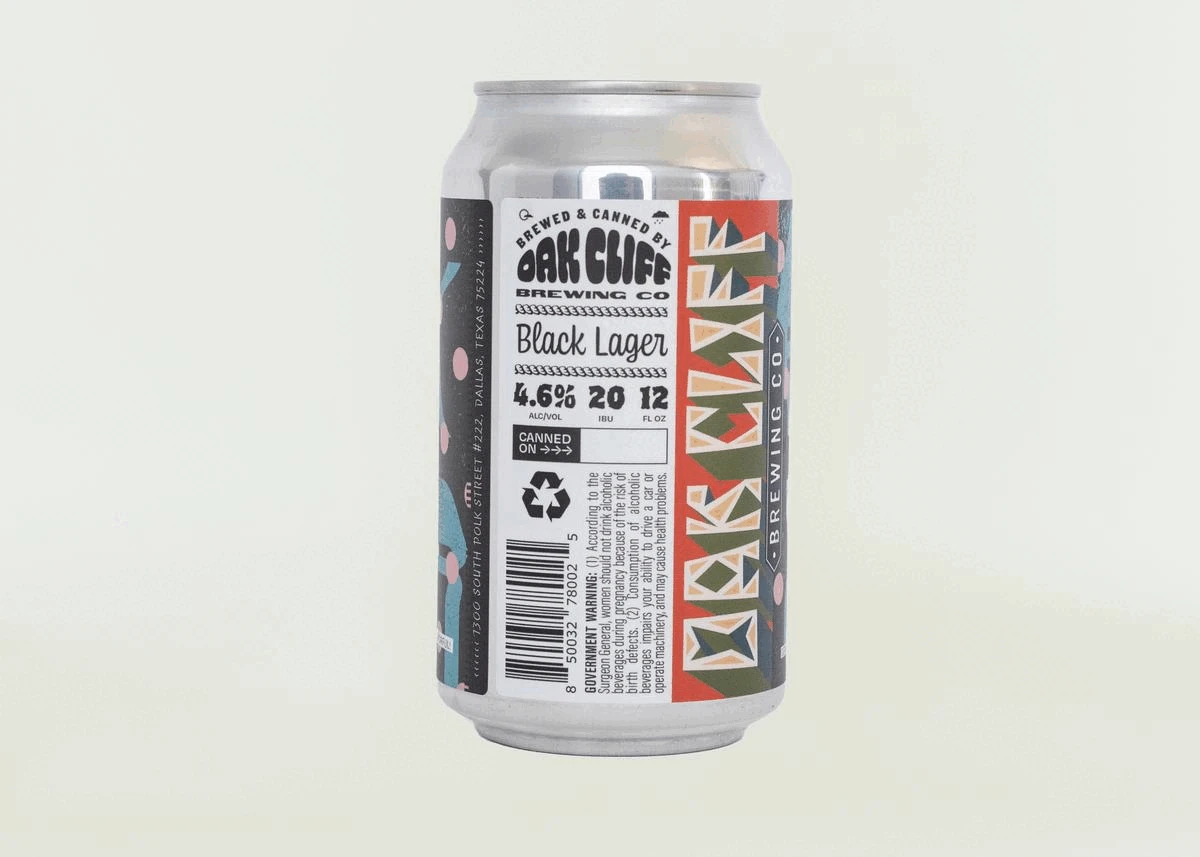
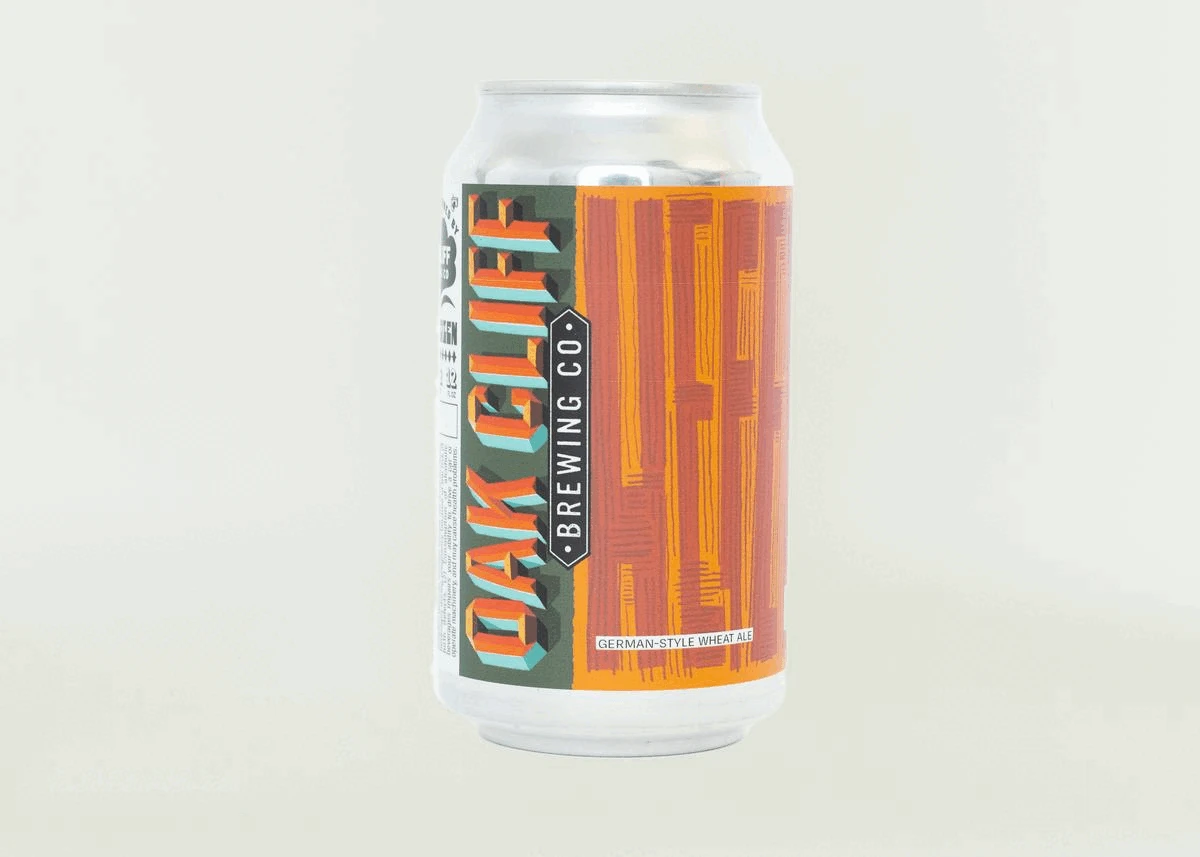
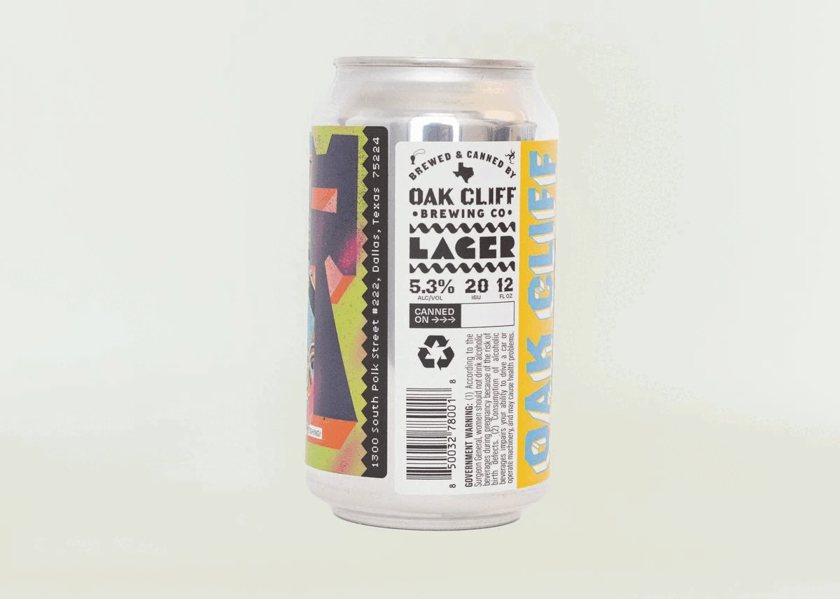
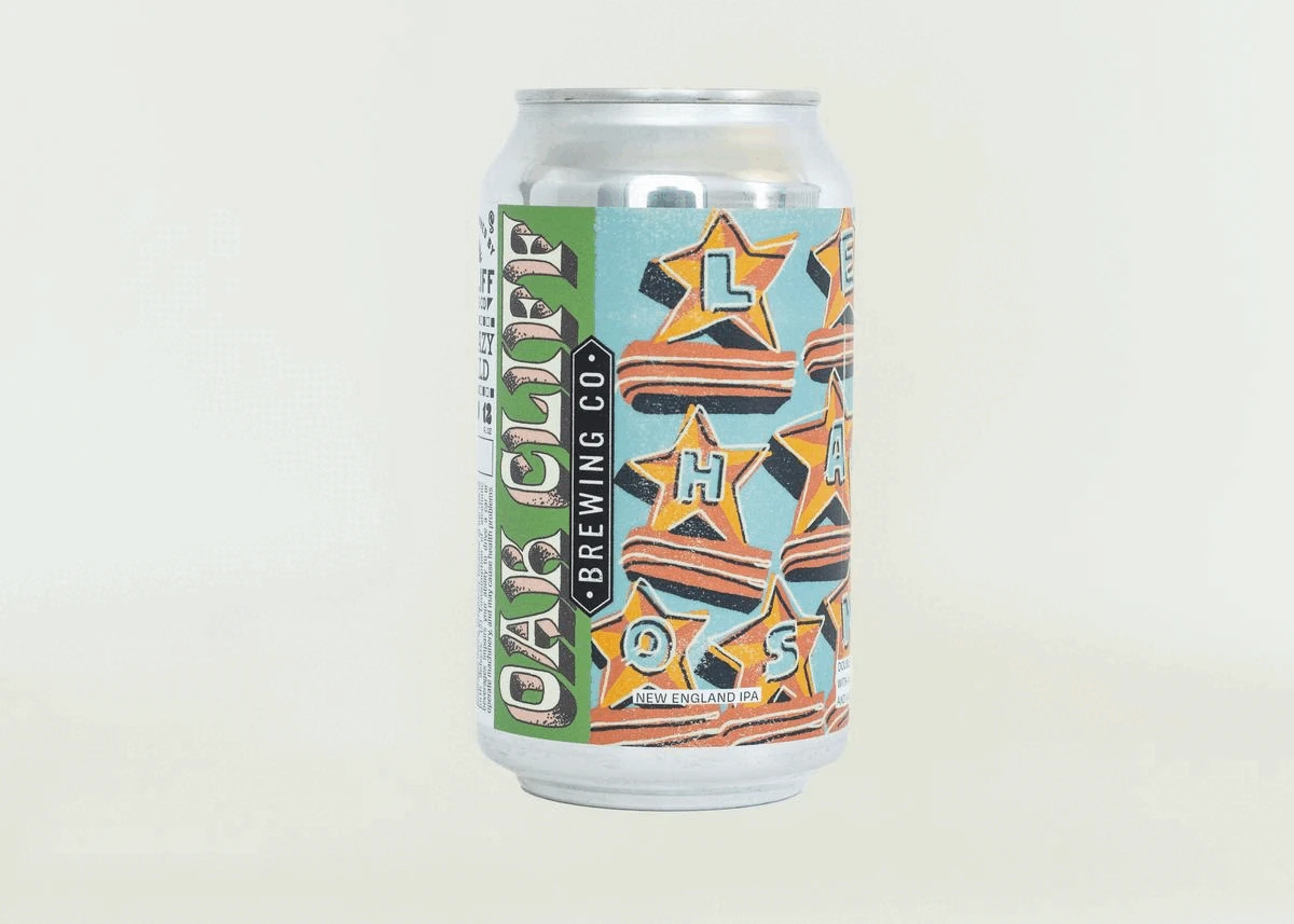
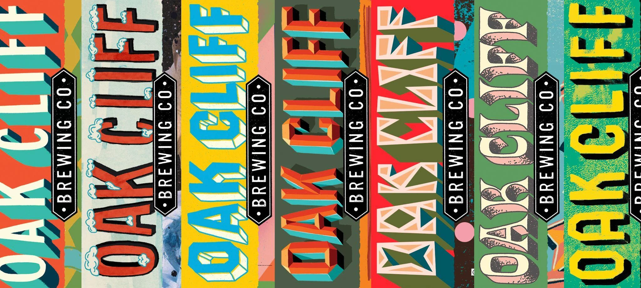
One name. Plenty of ways to say it.
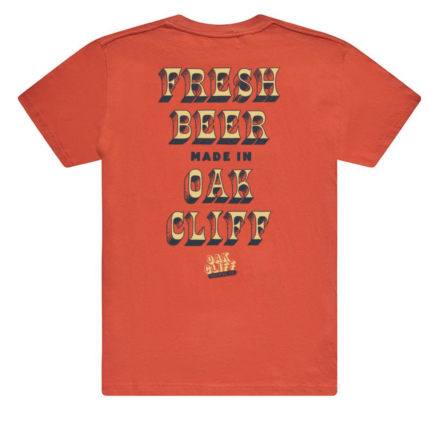
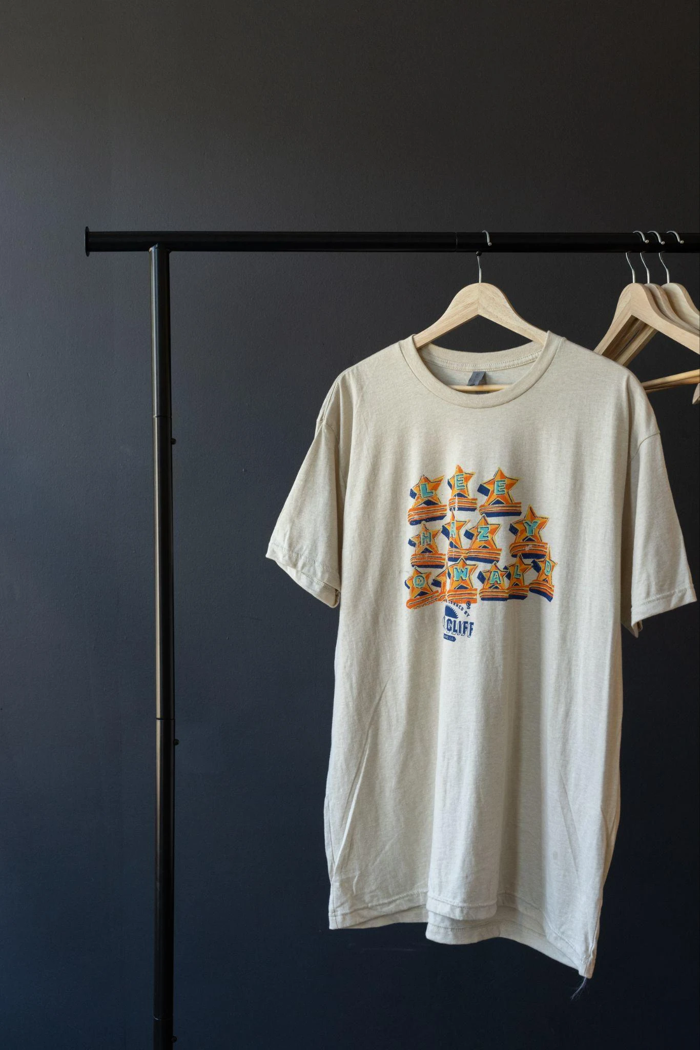
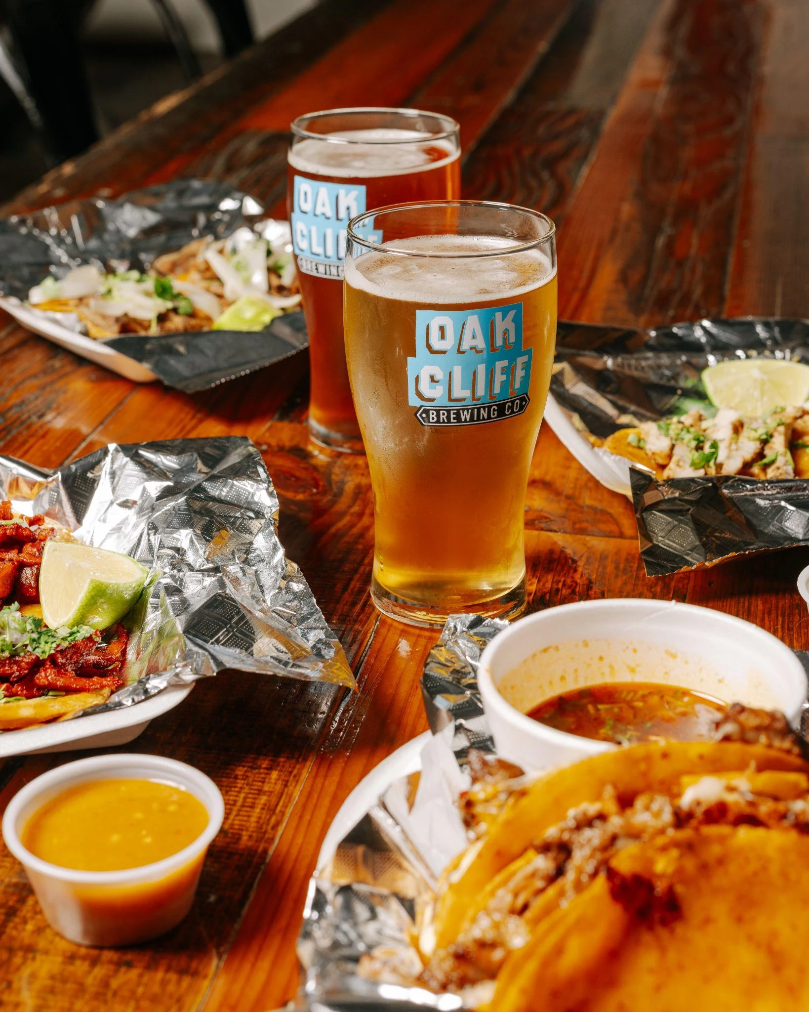
The interchangeable logo system leaves room for different colors and lettering treatments. The same visual language carries onto shirts, tap handles and painted signs.
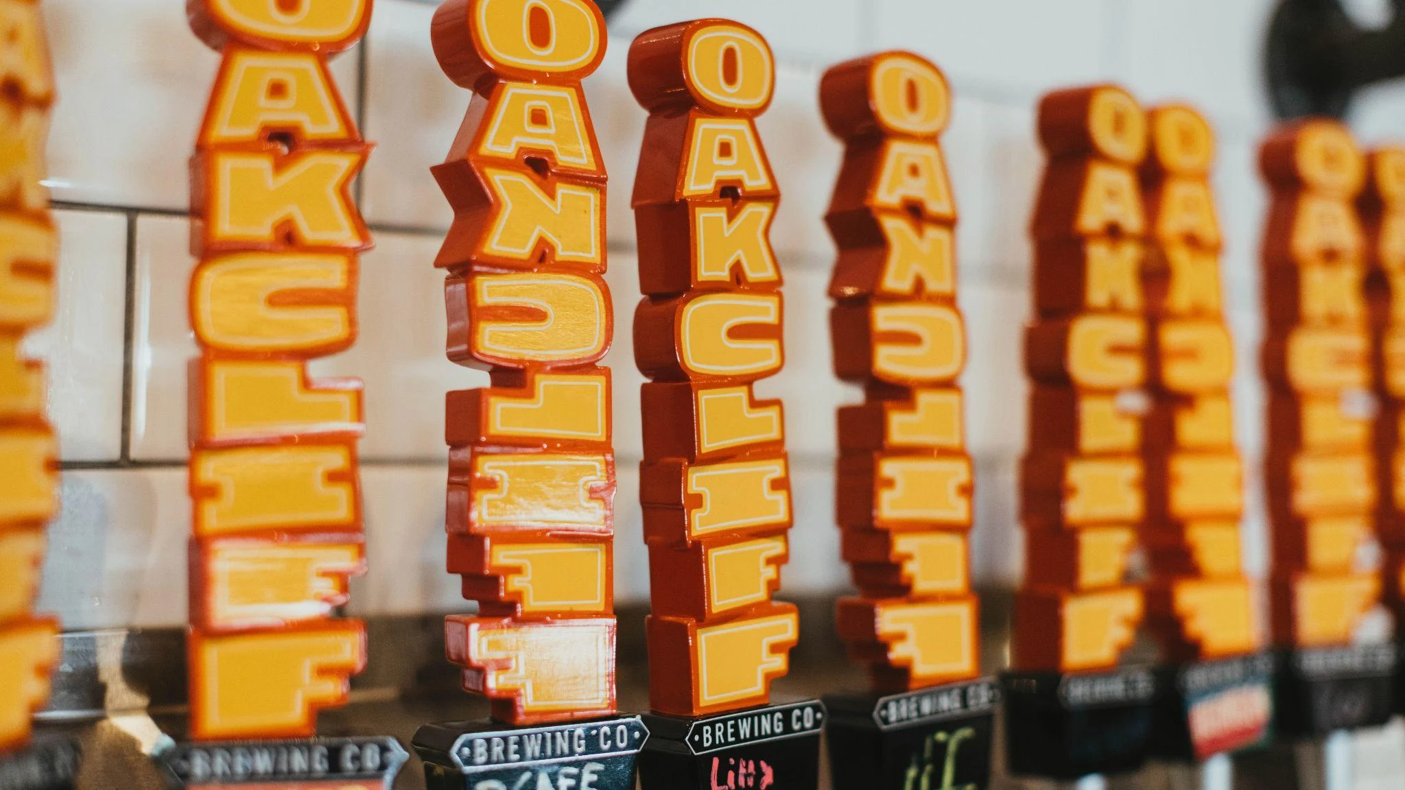
From the shelf to the street.
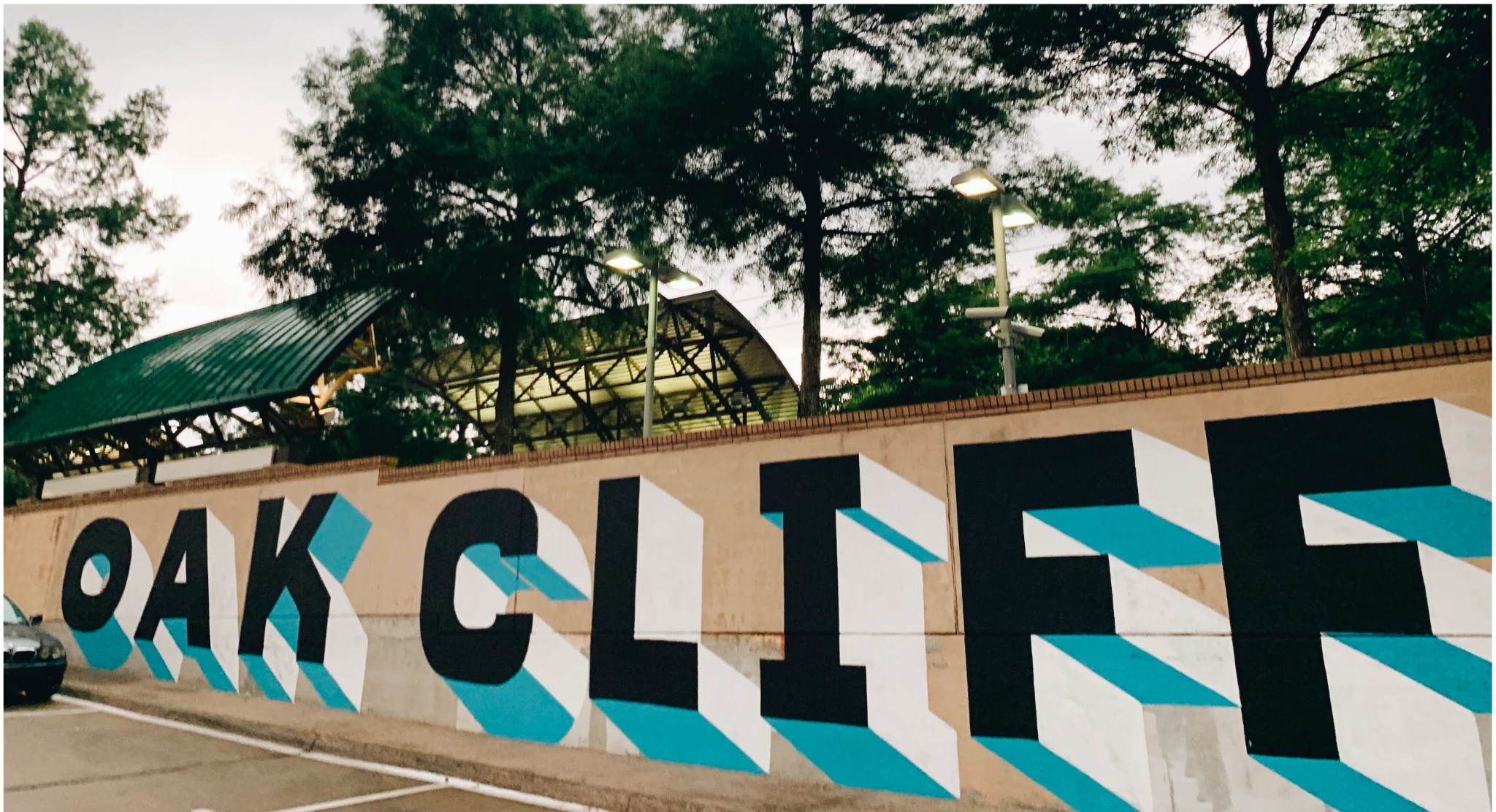
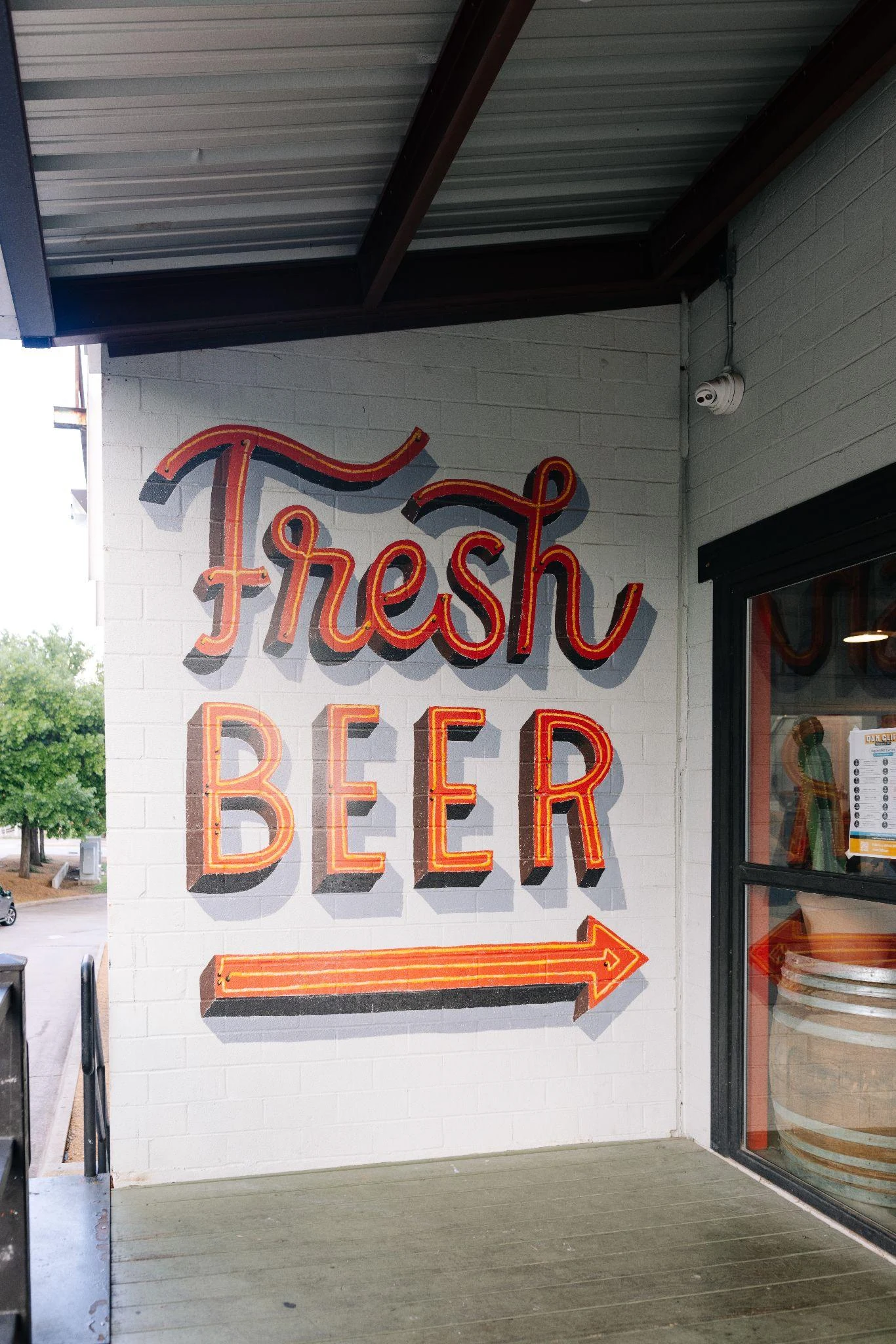
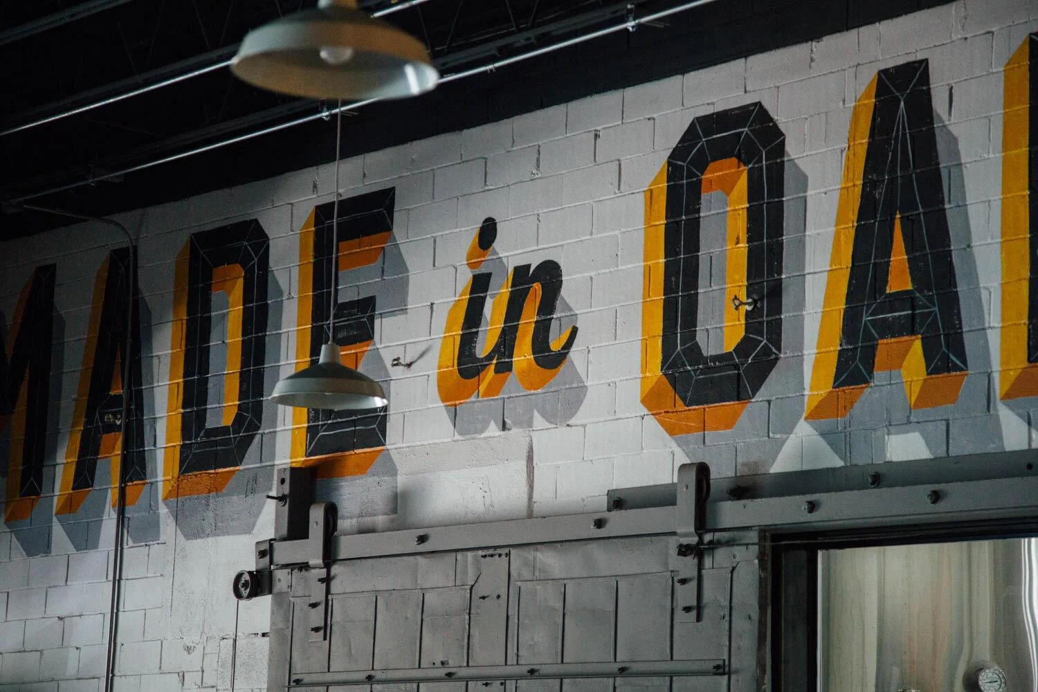
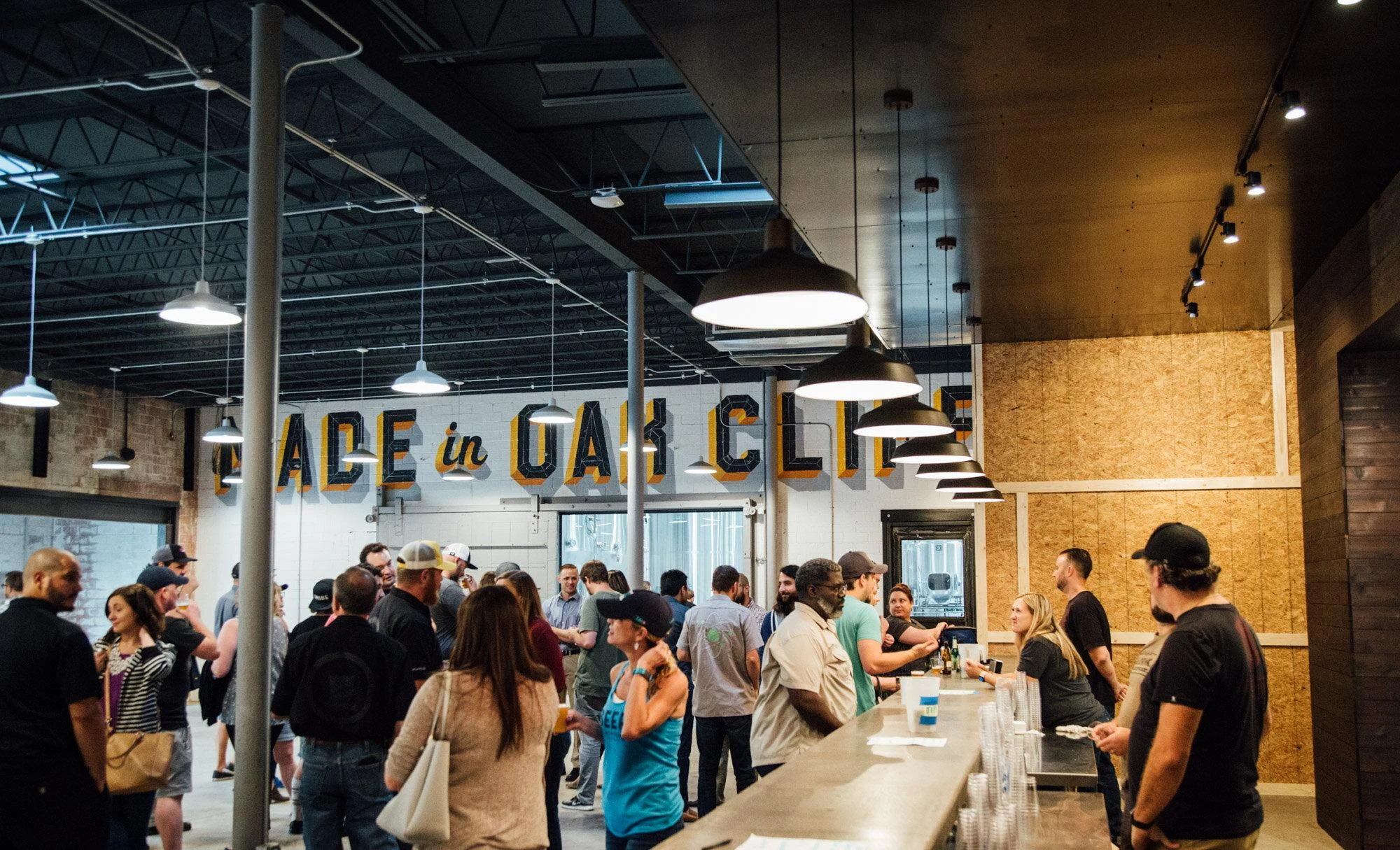
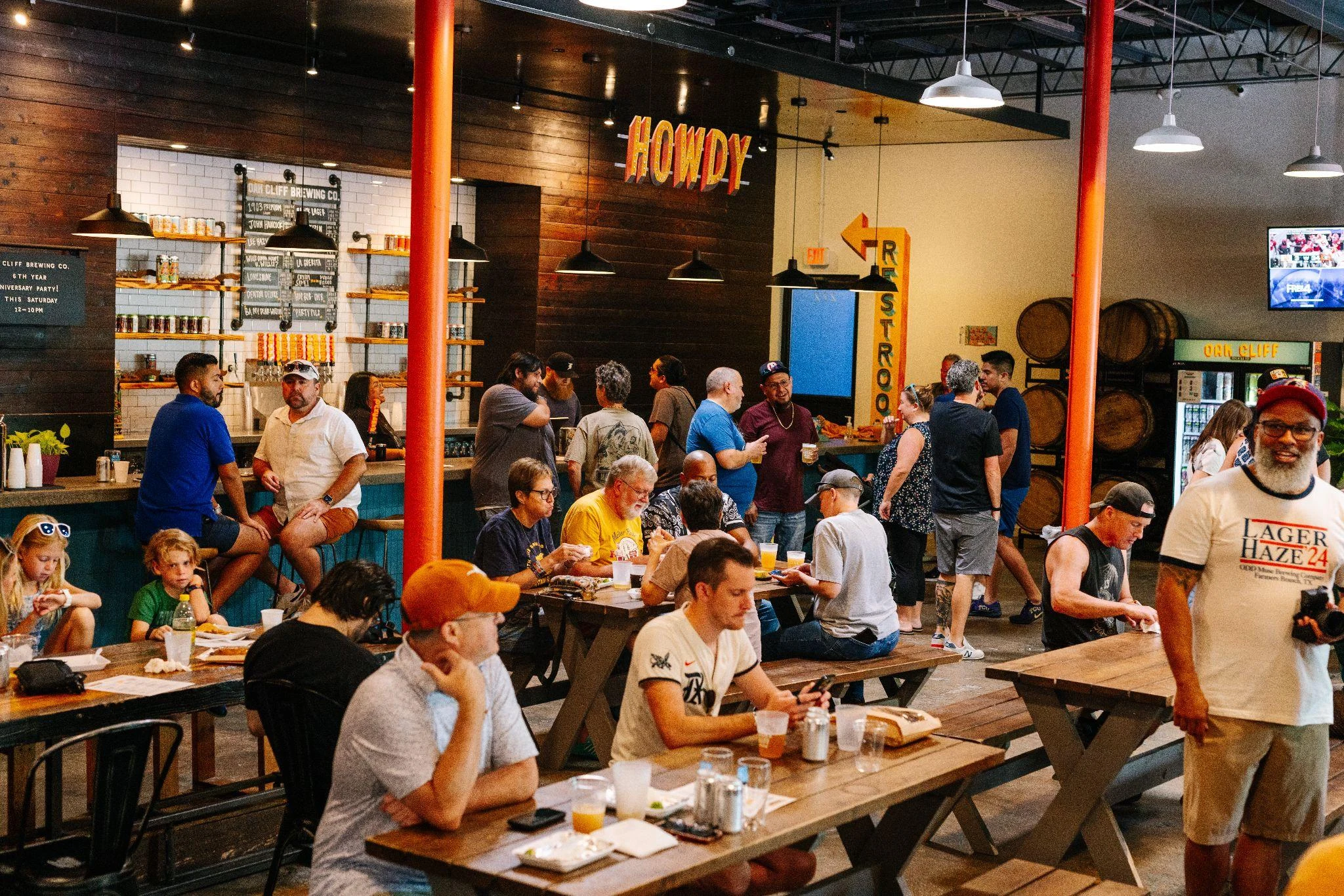
The identity finds a home throughout the brewery: exterior murals, the entrance, the bar and the places people gather. Hand-painted lettering brings the same personality into the physical space.
Oak Cliff Brewing Co.
Design and creative direction: Jeff Rogers. Studio: *TraceElement. Artwork and project photography supplied in the Oak Cliff Brewing Co. identity presentation.